The devil’s in the details when it comes to judging men’s watches, and it’s never just about style choices or appearance. There’s a version of this conversation that’s purely about specs. Movement type, water resistance, lug width, etc. That version misses the point entirely. The details that define a premium watch aren’t just technical. They’re intentional. And knowing how to read them changes what you buy and why.
Craft Lives in the Parts Nobody Talks About
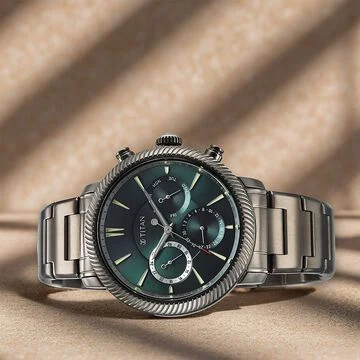
Most buyers focus on the dial, and that’s understandable. It’s what you see. But the parts worth examining most closely are often the ones tucked behind the obvious. Take the case’s finishing. Premium and stylish watches for men alternate between polished and brushed surfaces in a way that’s deliberate, not decorative. Polished bevels catch light differently from brushed flanks. That contrast isn’t accidental. It’s hours of hand-finishing that factories producing in volume simply won’t absorb the cost to do properly. Then there’s the crown. It’s a small thing-knurled or smooth, screw-down or push-in-but consider the way it seats, the resistance it offers, and the tactile precision when you wind it. That tells you more about a watch’s overall quality standard than almost any other component. Premium isn’t always loud. Sometimes it’s the quiet parts that speak the clearest.
Movement Depth and What It Actually Signals
Different movements function differently. The gap between them, though, isn’t always where people think it should be. Here’s a useful way to think about it:
| Movement Tier | What It Signals | Typical Context |
|---|---|---|
| Swiss ETA/Sellita base | Reliable, serviceable, trusted | Mid-range to accessible luxury |
| In-house calibre | Brand investment, exclusivity | Higher-end positioning |
| Decorated/visible | Craft statement, collector appeal | Heritage and prestige pieces |
Having an in-house movement does not equal better timekeeping. What it does indicate, though, is that a brand has owned the majority, if not all, of the manufacturing process and, as such, generally adheres to better quality controls across the entire watch, not just the movement. Decoration matters too. Côtes de Genève finishing, perlage on the baseplate, bevelled bridges. These aren’t functional. They’re a signal that someone, somewhere in the production process, cared about parts you’d never see with the caseback closed.
The Dial as a Design Argument
A dial isn’t just a surface; it’s a position. The spacing between indices, the depth of applied hour markers, and the way a hand sweeps (or stutters, in quartz) across the face. Each choice is an argument about what the brand believes a watch should feel like to read. Sunburst dials that shift colour under light are not a gimmick. They’re evidence of a metallurgical process that costs more to execute than a flat painted surface. Legibility and refinement aren’t opposites. The best dials balance both without leaning too hard on either.
Pieces That Demonstrate What Premium Attention Looks Like
Some watches made these principles concrete in ways worth examining. The Bulova Tony Bennett NYC97B244 carries something most watches don’t. It is a genuine cultural reference point. The connection to Tony Bennett isn’t marketing decoration. It’s expressed in the design itself, with detail choices that reflect the craft sensibility of a specific era in New York. Bulova’s high-frequency movement runs at 262 kHz, giving it accuracy figures that most technical movements can’t match. Precision as a form of tribute. The Edox Delfin The Original takes a different stance. Swiss-made, built around a heritage dive reference, it combines water resistance with a design language that hasn’t chased contemporary trends. That kind of restraint comes across as confidence. Dials built for genuine readability underwater don’t need to be redesigned every few years because they were never trying to be fashionable to begin with.
For something more utility-forward, the Wenger Terragraph Chrono 43mm brings chronograph functionality into a wearable, everyday package. Black dial, silicone band, blue markers. The colour contrast is not arbitrary; it is a legibility decision. Wenger builds for performance conditions, and the Terragraph shows this commitment by ensuring that every visual element earns its place on the dial.
Strap and Bracelet as Final Argument
A watch doesn’t end at the case. Where it meets your wrist matters as much as anything above the lugs. Solid end links on a bracelet, the kind that integrate flush with the case rather than gapping slightly, are expensive to machine and easy to overlook. Leather straps with bevelled edges and tonal stitching take longer to finish than a raw-cut alternative. These aren’t details that show up in spec sheets.
What to pay attention to when evaluating a strap or bracelet:
- End link fit: Does it sit flush against the case, or does it gap slightly?
- Clasp quality: Does it open and close with resistance, or does it feel loose?
- Strap thickness: Does it taper naturally towards the buckle?
- Stitching: Is it even, recessed, or raised against the leather surface?
Small things, but they’re the difference between a watch that feels assembled and one that feels considered.
Summary
Buy a premium watch once, and you understand something that’s hard to explain to someone who hasn’t. The details stop being just details. They become the whole point.
You’re not paying for a function that a cheaper watch couldn’t perform. You’re paying for how thoroughly someone thought through every square millimetre of the object. That thoroughness is what you wear.